One Wall, Three Audiences: Choreographing Your Living Wall for the Doorway, the Couch, and the Sink
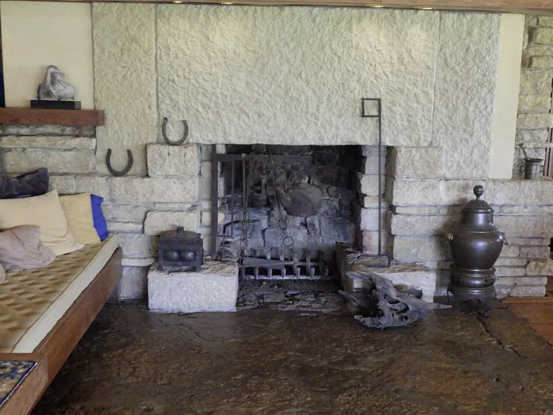
Photo: Bmzuckerman, CC BY 4.0, via Wikimedia Commons
Here's a party trick we run at almost every Albany consultation: instead of standing in front of a client's living wall admiring it, we walk the room. We stop at the front door. We sit down on the couch. We lean against the kitchen counter. And almost every time, the homeowner is surprised — sometimes a little horrified — by what the wall looks like from those three spots.
The wall you designed is not the wall your guests experience. That gap between the two is where good living wall design actually happens.
The Wall You See vs. the Wall They See
When you install a living wall, you spend most of your time six feet away, straight on, at eye level. That's the installer's view, and it's the view in every photo on every product page. It's also the view almost nobody in your home ever gets.
Real people experience your wall in motion. They catch it at an angle through a doorway. They see it flattened from across the room. They notice it in a hallway mirror's reflection while filling a water glass. A living wall is less like a painting and more like a stage set — it has to hold up from multiple seats in the theater.
We call the three most important vantage points the doorway, the couch, and the sink. Design for those, and everything else takes care of itself.
The Doorway: The Three-Second First Read
A guest stepping into your home gives your wall about three seconds of attention. In that window, they're not reading individual plants — they're reading shape, density, and color contrast. Think of it like a book cover.
What works at the doorway:
- Bold massing over fine detail. Delicate ferns that look exquisite up close turn to visual mush from twenty feet. Anchor the section nearest the entry with larger-leaf plants — pothos, philodendron, bird's nest ferns — so the silhouette reads instantly.
- One deliberate color moment. A single pocket of variegated or burgundy foliage near the top third of the wall pulls the eye up and makes the whole installation feel intentional.
- Symmetry you can break. A slightly asymmetrical composition feels alive; a perfectly even grid feels like an office lobby. Save the formality for commercial spaces.
If your wall is visible from the front door, treat that sightline as sacred. Walk your entry path, open the door, and look. Whatever greets you in the first three seconds is your headline.
The Couch: The Long Relationship View
The seated view is the opposite problem. Someone parked on your sofa for a two-hour movie night has all the time in the world to study your wall — including its flaws.
From a low, angled seat, a few things change:
- You see the structure. Mounting rails, irrigation lines, and patchy bottom rows that hide at eye level are all exposed from a low vantage point. Choose a panel system with a clean face, and plant the lower third extra full to disguise hardware.
- Trailing plants become the stars. From below, vines and cascaders dominate the composition. That's good news — trailing pothos is cheap, forgiving, and thrives in most Albany living rooms — but it means you need to prune with intent. A wall that's 80 percent vine from the couch looks untidy, not lush.
- Backlighting matters more than front lighting. A lamp behind or beside the wall creates depth and shadow that a flat overhead light can't. If your wall is a focal point of the seating area, give it its own light source. (We've covered lighting before — it's the difference between a wall and a backdrop.)
The couch test also reveals maintenance reality. Guests at the door forgive a yellowing leaf. Your movie companion at eight feet does not. Walls in primary sightlines of living areas should be planted with your most reliable performers, not your experimental specimens.
The Sink: The Reflected, Glancing View
The third audience is the one homeowners forget entirely: the peripheral, often reflected view from the kitchen. In a lot of Albany colonials and row houses, the kitchen looks down a hallway or through a doorway toward the living room — and the living wall appears in a window's reflection or through a pass-through, in glimpses.
Glance views reward rhythm, not detail. What carries a wall seen in passing:
- Repetition. Repeating one plant every second or third pocket creates a pattern the eye can register in half a second.
- Height contrast. A mix of upright and cascading forms creates movement that registers even in peripheral vision.
- Brightness. Walls seen from a bright kitchen across a darker hallway need lighter, glossier foliage — dark, matte leaves disappear in the shadow zone. This is where the shadow problem we've talked about before quietly sabotages a design that looked great on install day.
The Five-Minute Choreography Audit
You don't need to hire anyone to fix a wall that underperforms. Try this:
- Walk the three stations. Front door, couch, kitchen sink. Spend thirty seconds at each, actually looking.
- Photograph from each spot. The camera flattens the view and makes gaps obvious in a way your brain edits out in person.
- Fix the weakest view first. Usually that means filling the lower third, adding a color accent at the doorway sightline, or relocating one fussy plant to a spot nobody stares at.
- Re-test after a month. Plants grow unevenly; the view from the couch in week six isn't the view from install day.
One wall, three audiences, three different jobs. Design for the person at the door, the person on the couch, and the person at the sink — and your living wall stops being a decoration and starts being a performance.